For 2024/25, colour has been pushed out of the comfort zone in which it has firmly sat for the past five-years. Understandably, 2021/22 centred on putting people at ease in commercial spaces through mirroring interior elements found in the home. But now, a couple of years later and we’re seeing a braver stance taken by designers collaborating with their clients to encourage workforces, students, guests, and consumers back into bricks-and-mortar destinations.
To do this, rather than create symbiosis with residential environments, the emphasis is placed on crafting experiences that need to be sought out and ventured to. In line with this, colour palettes have moved from neutrals to richer shades, hues with a hint of the otherworldly, and unexpected, occasionally clashing, combinations.
Taking inspiration from Crown Paints 2024/25 Colour Insights, Colour Hive & WGSN, here we share some of our colour trend highlights for the year ahead.

Organic
As sustainability moves higher up the agenda, and biomaterials take more prevalence in the design of commercial schemes, nature-inspired palettes are favoured, both in terms of colour and texture. Wood is very much in the spotlight, with its unique variation of pattern acting as a visual storytelling device.
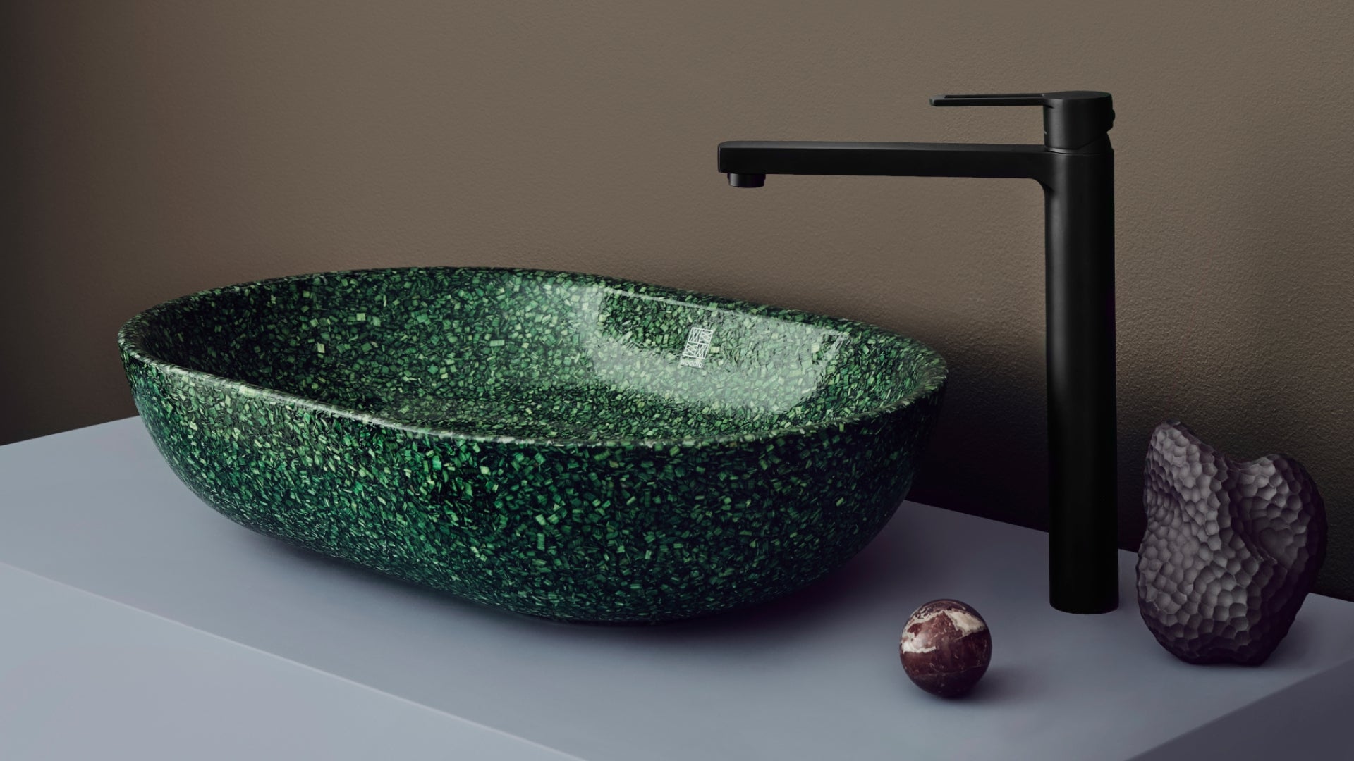
This has inspired the design of Woodio® products, with the flecked appearance of woodchip combined with a Core Collection of earthy colours originating in Finland’s forest terrain.
Included as part of the Solutions trend developed by Crown Paints, which showcases how design can learn from the natural world, nature is embraced in all its forms, textures, and imperfections, including “accidental colour palettes often found in recycled materials.”

With this in mind, as well as more pared back tones, “desaturated blues, greens and neutrals, sit alongside small accents of brighter blue and green shades, inspired by sea and river glass.”
At Woodio, this has spurred offerings such as Moss and Root – putting a contemporary spin on the long-standing trend for design that reflects nature.
Overt
In direct response to the move away from interiors that solely comfort, bolder colours are dominating more than ever. This isn’t to say they’re not appealing to those that inhabit a space, but they provoke thought rather than visually sooth.

It might be a pop of unexpected red – our Berry colourway is a good example of this, with purple undertones adding just the right amount of stand-out to washroom interiors. Or orange paired with cobalt blue, as has been chosen for Material Source Studio Glasgow by co-founder and creative director, Darren Clanford.
This sense of thoughtful fun was also considered as part of Crown Paints’ Colour Insights, with the Community palette, which features primary red, yellow, and green, as well as hot pink for bold accents, being about “using colour to create joyful, invigorating spaces that bring people together.” Inspired by individuality, inclusivity and identity, this collection celebrates brave design choices, encouraging bold colours, high contrast, and colour blocking.

Unexpected combinations
Tying into this lean towards using bolder shades in commercial schemes is the choice of confident, sometimes clashing, colour combinations.
‘Mine’ features as part of Colour Hive’s Colour Directions 2024/25, and takes visual cues from the striking pairings found in minerals. Sulphur Mines “balances tint, tone, and saturation” using green as the “connecting thread”. Opal sits against Viridian, and Sulphur – “in a sci-fi aesthetic”, both unusual and otherworldly. While, for Live-Wire, Electric Pink contrasts with a zap of Lapis Lazuli blue – a full-blown feast for the eyes.
In product design, WGSN embraced colour clashing in a recent collaboration with Puma where “joyful” was central to the brief.
The concept of unexpected colour and textural combinations also formed the basis for the washroom scheme at Material Source Studio Glasgow, where Woodio® basins served as the creative catalyst for a blend of burnt orange and dappled tortoiseshell.
To find out more about how Woodio® UK can complement – or clash – with the chosen colour palette in your next scheme, get in touch.


